


Using a live example I will take you through the information architecture of a ux project completed in 2019.
The process includes:Definition of company goals, analytics, product research, user research, user personas and goals, user journeys, competitor analysis, site mapping, navigation, wireframing, prototyping, user testing, accessibility testing, design specification, post dev analytics, and project conclusion.
Tools: Google analytics, Hotjar, Google Lighthouse, Miro, Ve, Optinmonster, Optimizely, Google optomize, vwo, Zuko, Whimsical.
Company background Minicabit is a travel booking startup with 250,000 monthly visitors (pre-covid), however conversion was on average 4%. Majority of the bookings came from first time users.
My role As a seasonal business, my role was to use the ‘off season’ to discover, investigate, research, and design new products and better the user’s experience of the booking process.
Discovery process I started by checking google analytics to look for general page drop-offs across each page within the booking flow.
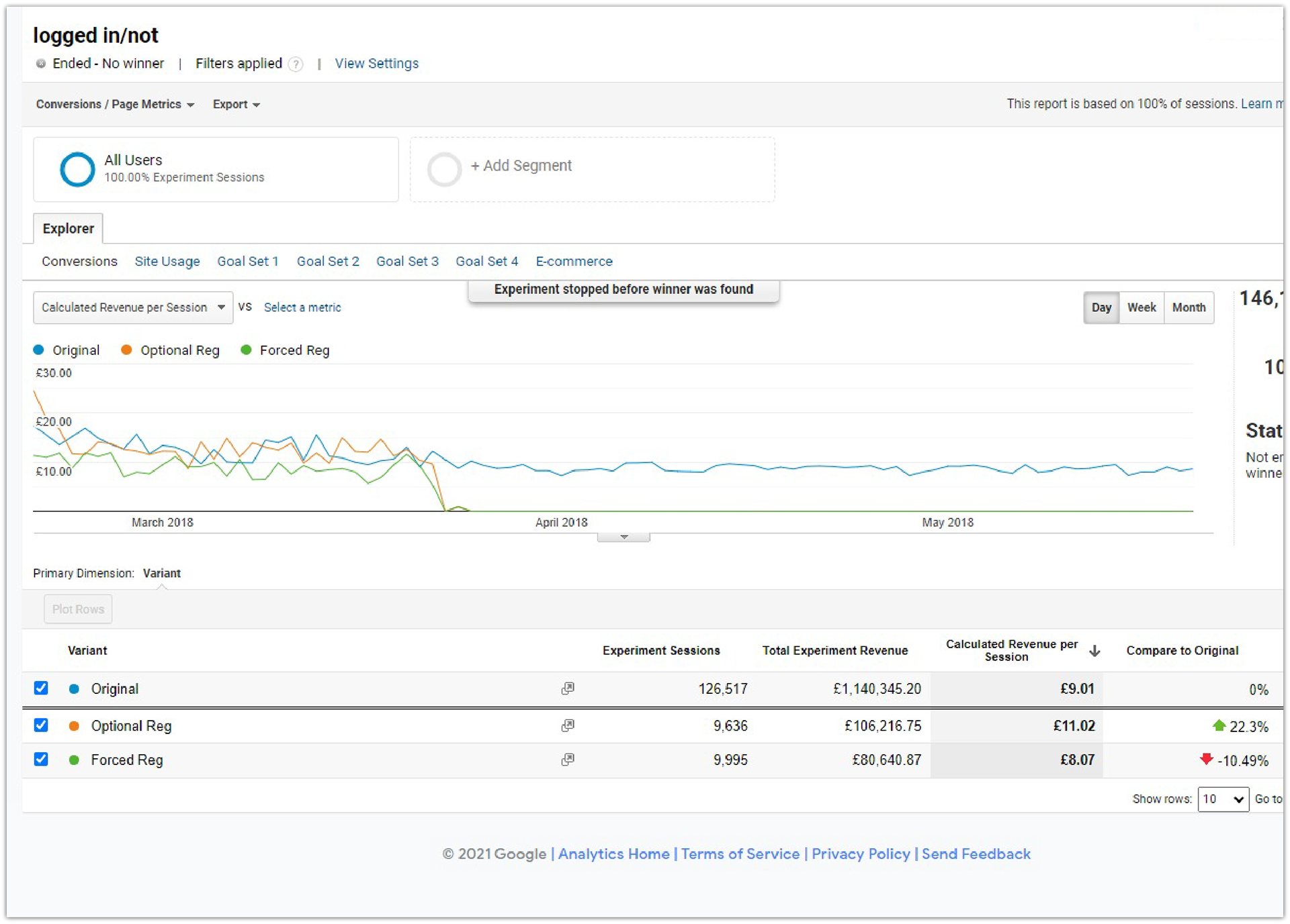
Google Analytics data

We’d expect a high number of drop-offs on the quotes page as many users used the site for comparison. Progressing through to login does show an element of intent and therefore we were alarmed to see the high level of drop-offs here.
I lead a product meeting with CEO, front-end dev, and customer manager.
I presented issues and suggested targeting this area to uncover reasons for customers with intent exiting the flow.
I discussed possible reasons including time to create an account, trust & security of data, and only intending to use the service once.
User research
Started initial research with heatmaps, exit surveys and user videos. Questions were targeted to know why it was people were leaving the flow.
Hotjar Heatmap data was used to see where users were interacting with the page. Screen recordings were viewed to follow the journey of the users’ focus.
Ve Chat survey to discover how easy the user is finding the booking flow. Linked to Typeform.
Optinmonster Captured departing users and linked to Typeform questions.
Intercom Used for live customer surveys.
Typeform Questions related to reason for exit.
Collated feedback in common order: Not wanting to create an account, No time to create an account, Forgotten password, Wanted to check journey details, Only wants to use the service once, Decided it was too expensive.
User interviews to discover new ways to increase conversion.

Market research
Competitors analysed to see where their login is positioned within the flow.
Pain points: Being forced to login before seeing final price, Not being able to check journey details, Time limit to complete login or register.

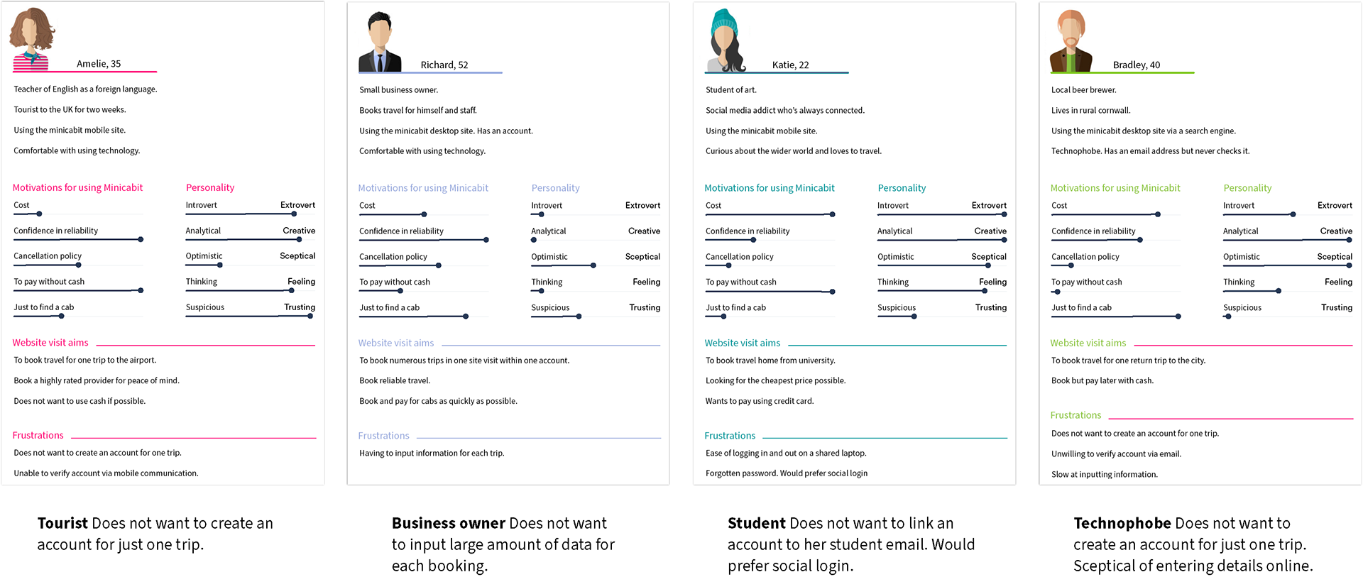
User personas
From the knowledge of our customer base and the collected research in relation to the page drop-offs, I created user personas to understand the pain points of our customers.
The four personas below represent key demographics and the specific target audience to focus on.
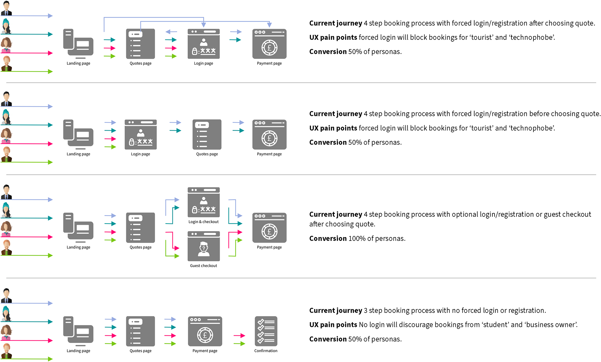
User journeys
I created user journeys (both current and prospective) from which I was able to present that a guest option but keeping the login too would increase conversion.
Wireframing
Visualizing the basic structure of the guest checkout page using paper sketches and sketch.
Agile process involving developers and product managers.
Wireframe option 1, Popup overlay
Pros Clear direction for the user, faded background for hierarchy.
Cons Hidden journey information, Potential issue with popup blockers
Wireframe option 2, Within ‘my account’
Pros Potential for full width data entry.
Cons Hidden journey information, User taken out of the booking flow.
Wireframe option 3, side by side
Pros All journey information clearly visible, User is kept within the booking flow.
Cons Possible confusion of users

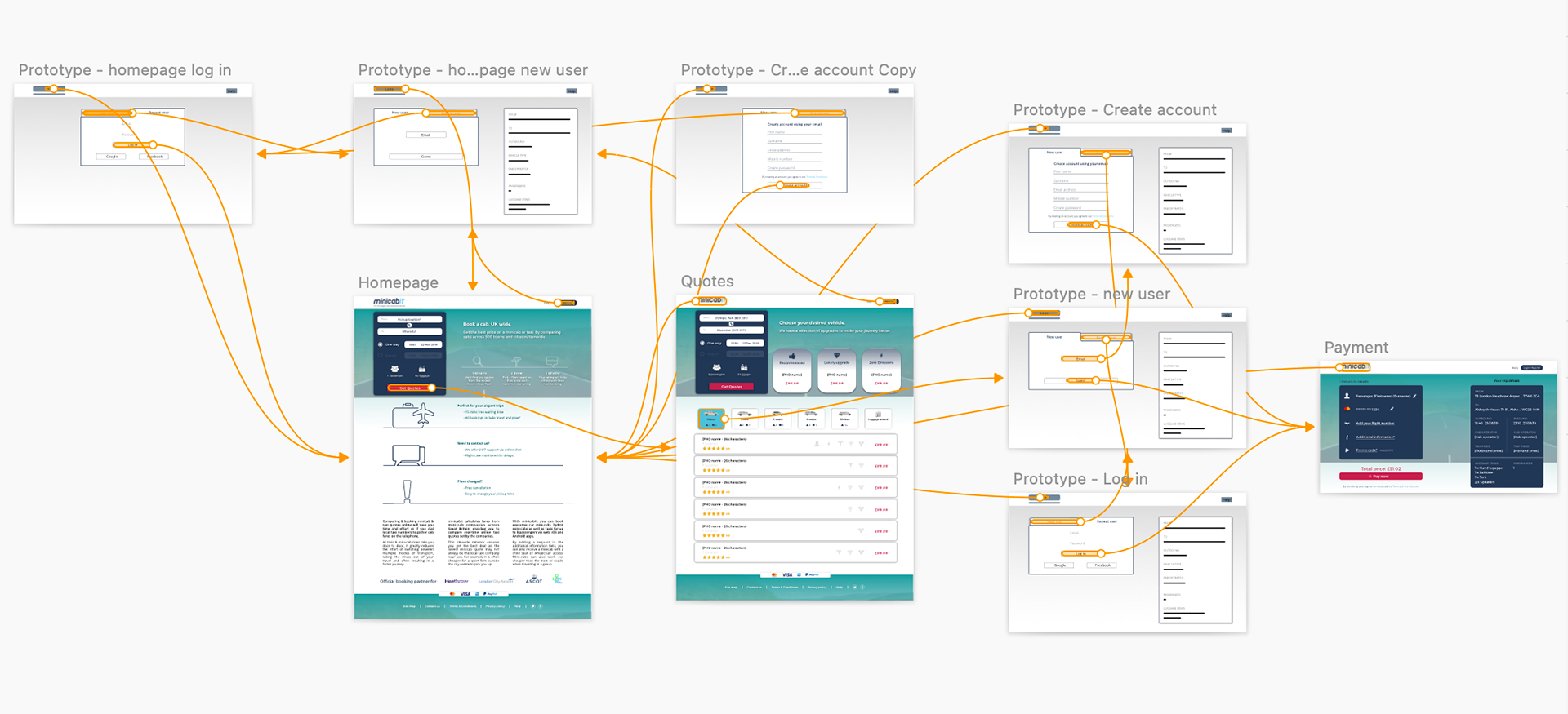
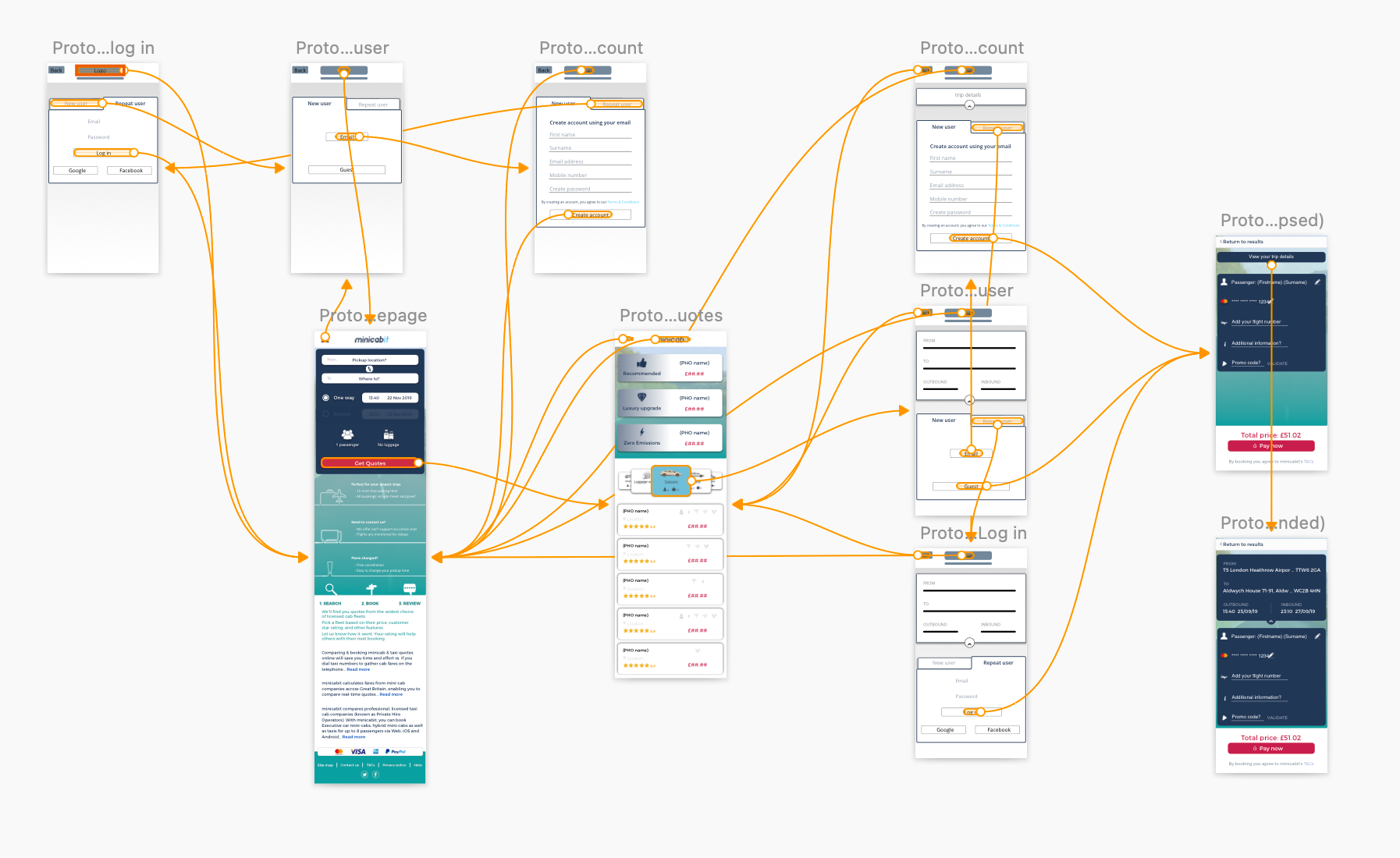
Prototypes
Clickable wireframes of all three above wireframes in Sketch and Invision.
Sketch used to demonstrate the user journey through the booking flow
Invision build mode used to create a clickable prototype to present to CEO and developers.
Accessibility In-depth accessibility tests inline with W3C standards and tools used to check colour blindness, text size, page loading.
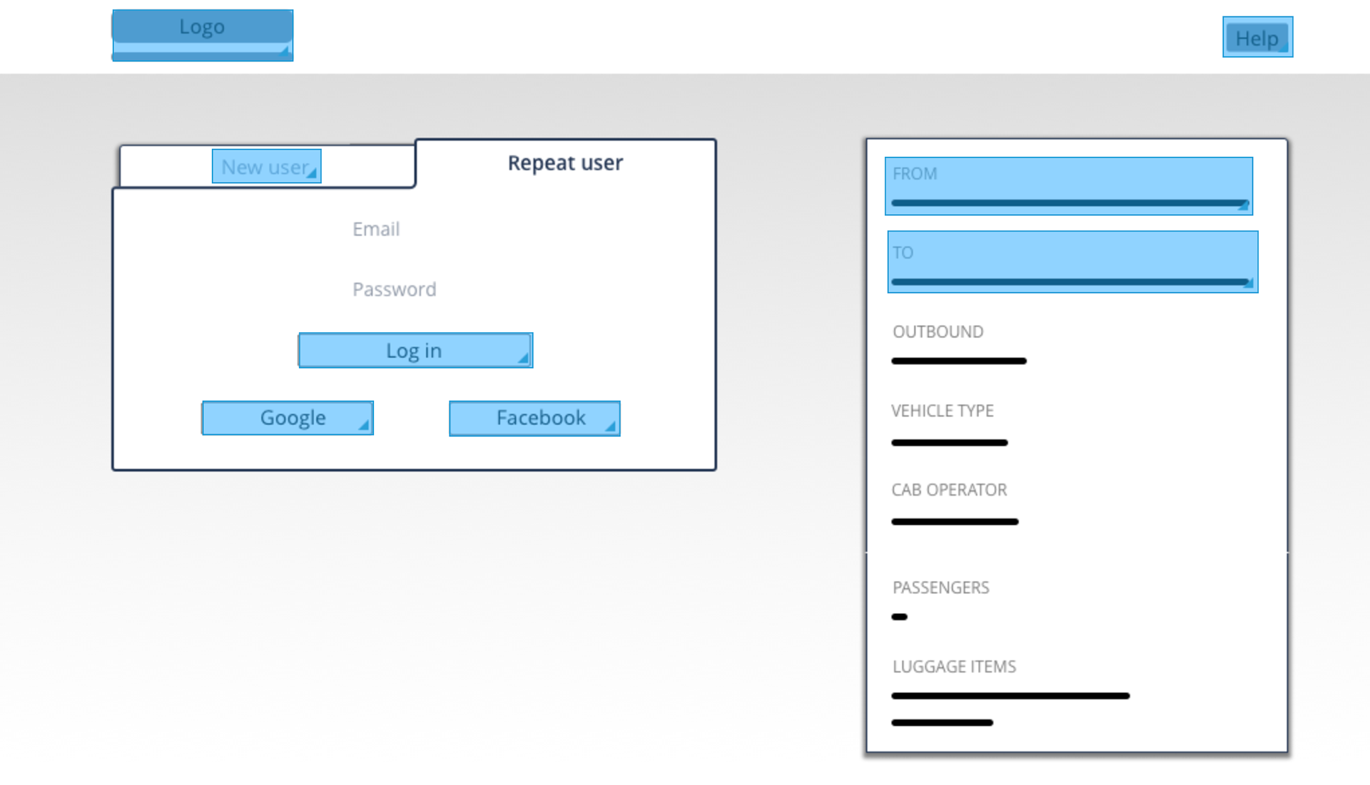
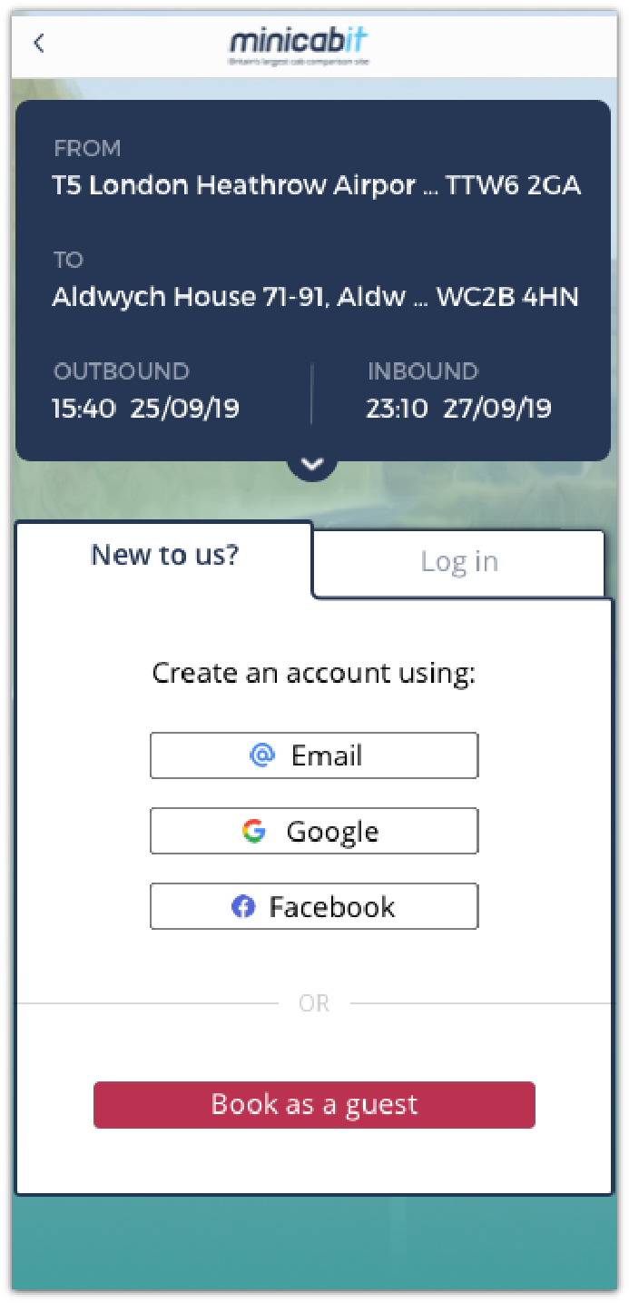
Sketch clickable prototype showing the user journey including guest checkout on desktop
Sketch clickable prototype showing the user journey including guest checkout on device
invision build mode
Users testing
Surveys groups of customers screened to see if they would feel confident with booking without logging.
Select group of customers both for and against log in were contacted and sent a link for a working invision prototype.
Feedback gathered via typeform.
Iterations based on feedback included google log in and larger book as guest CTA.

Desktop default screen aimed at first time bookers
Device default screen aimed at first time bookers

Desktop log in with social options
Device log in with social options
Design specification
Design system bespoke internal library, moving to fuse elements within react codebase, component library, asset behaviour, animation, interaction feedback.
Visual digital assets including components are created and uploaded to Zeplin, Jira and AWS.
Visual digital assets including components are created and uploaded to Zeplin, Jira and AWS.
Development split in to sprints and phases
Phase 1 Book as a guest
Phase 2 Google integration
Phase 3 Facebook integration
Post development
Usability testing internally within a staging environment
A/B testing using Optimizely, Google optomize and vwo
5% for first 2 weeks, 20% for another 2 weeks, 100% thereafter.
5% for first 2 weeks, 20% for another 2 weeks, 100% thereafter.
Project conclusions
Decreased dropoffs 6 months in, dropoffs reduced from 70% to 62%.
Increased conversion 6 months in, conversion increased from 4% to 4.5% during off-peak and 7% during peak periods.
Improved UX An ongoing project, although the booking experience now contains less customer page exits.

Communication to developers via Zeplin including dev notes