


Project type: User research, UX journey mapping, Web design, UI / UX
Role: User research, Designer.
Tools: Sketch, Zeplin, InVision.
Project aims
Design a user-centric landing page proposal for Atom42’s ‘Digital Fitness Assessment’
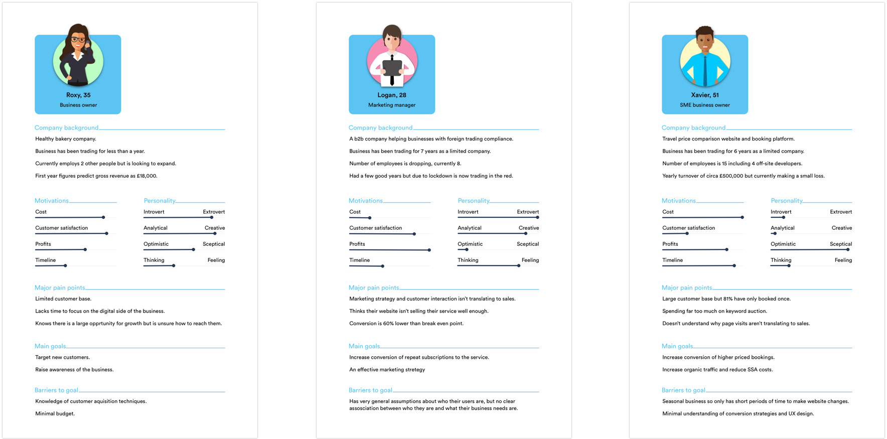
Analysis of user personas
To create an engaging landing page it’s important to consider the anticipated personas of visitors to the site. By understanding their pain points within their business it is possible to design a landing page which highlights their needs.
Below are three personas based on potential customers I interviewed who currently own or work within a SME.
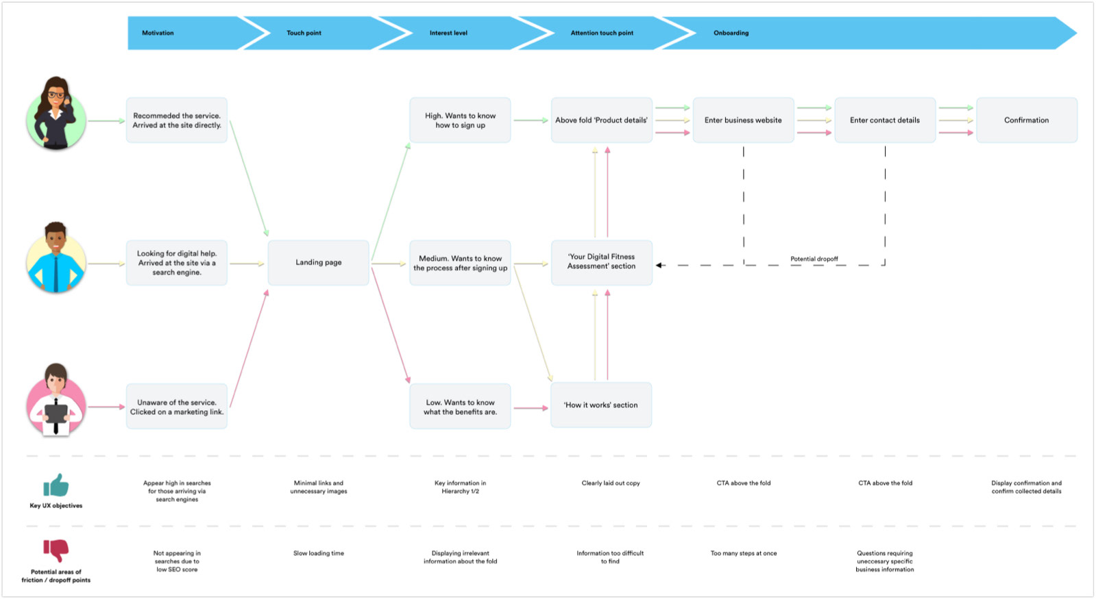
Analysis of user journeys
This user journey map focuses on the steps taken from arriving on the digital fitness assessment landing page through to confirmation of purchase.
This process helps to identify the priority of information for varying users and any potential drop-offs to avoid.
Key design goals
Lead the user to consider if their business would benefit from an increase in traffic or improved conversion rate.
Benefits of the digital fitness assessment should be clear and concise.
Benefits should address common pain points by highlighting the product service.
Service highlights need to address the time scale involved.
The website should inspire confidence with ‘warm’ images, clean design, and well laid out information.
Statistics inspire trust and are easier for the user to scan.
Key conversion rate optimisation goals
Call to action should be clear and above the fold.
Remove unnecessary steps and clicks to view product information.
To avoid friction areas the design should have an intuitive layout based upon standard practises
Research analytics suggests the use of the F-shaped pattern for reading web content - placing critical information on the left side leads to higher engagement.
Use of icons and imagery to highlight information and draw attention.
Burger menu positioned in the top left on devices.
Maintain company wide header links.
Avoid any potential drop-off points, including any questions which may cause the user to quit the purchase process. For example, “What is your monthly website traffic”.

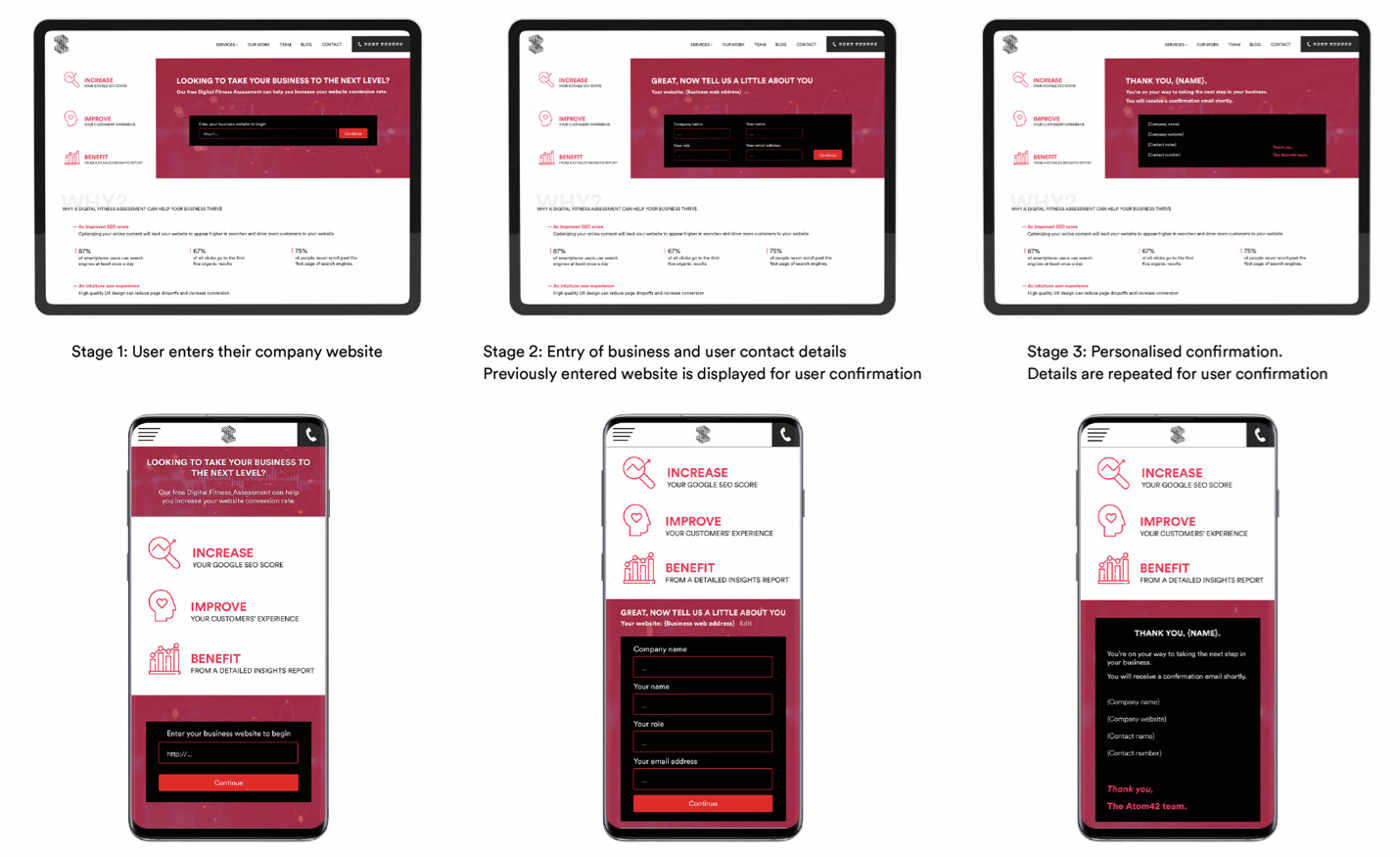
The Purchasing process
The purchasing process is split in to three sections, all of which are positioned within the landing page and above the fold.
The aim is to keep the key benefits of the product displayed throughout while also not blinding the user with many data entry inputs at once.
Design rationale
Key elements above the fold
3 highlighted selling points are clear, concise and positioned on the left for higher engagement.
Cost mentioned above and below the fold to alleviate any ROI concerns.
Call To Action positioned clearly to direct users to the purchase process.
Page is split up into ‘Why’ and ‘How’ sections.
This is to allow the user to find the information related to their concern quickly and without having to wade through lots of text which may lead to drop-offs. Statistics are used to inspire trust and are easier for the user to scan.
Reviews
Positioned in the lowest hierarchy position- This is to prevent distraction from the purchasing flow. Much research has been completed in this area and it has been suggested that conversion can increased by 5% with reviews present.
Device menu structure
The ‘Why’, ‘How’ and ‘Reviews’ sections have been designed in a sub menu on devices. This is to avoid long scrolling and ease of access to the information.
The purchasing process
On desktop and device the whole process is positioned above the fold.
The purchasing process is split in to three sections, with an option to edit the web address during the process. The aim is to keep the key benefits of the product displayed throughout while also not blinding the user with many data entry inputs at once.
Images
Use of three ‘warm’ and ‘clean’ images related to the product and reviews. Positioned to split up and highlight text rather than be attention grabbing and distracting.
