

Project type: UI design and UX analysis
Client: Central Nic
Role: User research, designer.
Tools: Sketch, Illustrator, Zeplin, InVision.
Project background: The brand wished to go beyond domain names and encourage users to buy add on services like web and email hosting that are needed to build a website or setup business emails.
Project aims: Design a solution of how this add on product can be made a part of the customer purchase flow.
New UI and user flow proposal
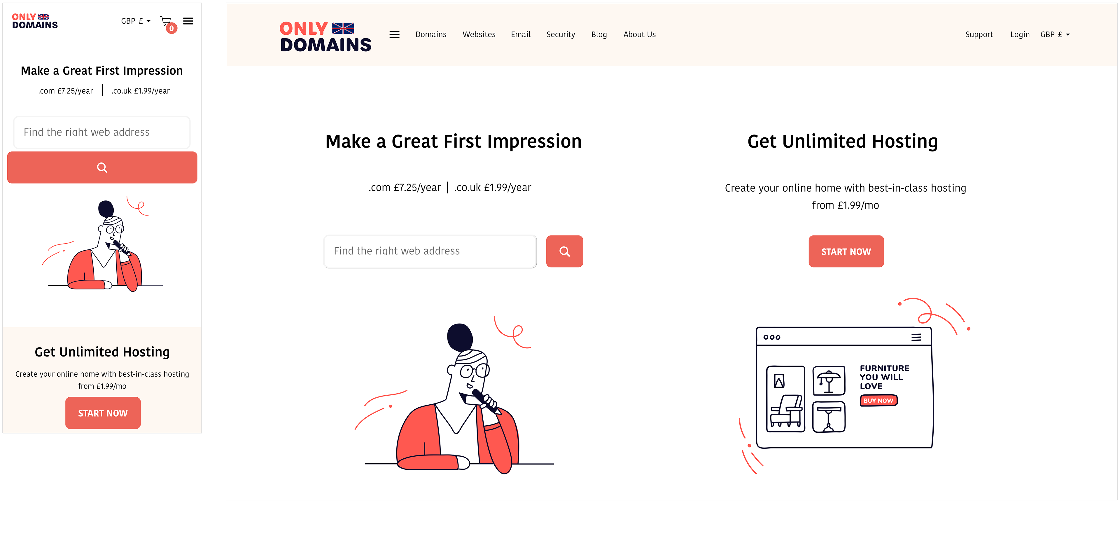
Homepage
New page and step within the flow to promote add-on services. Positioned after domain selection and before login/signup.
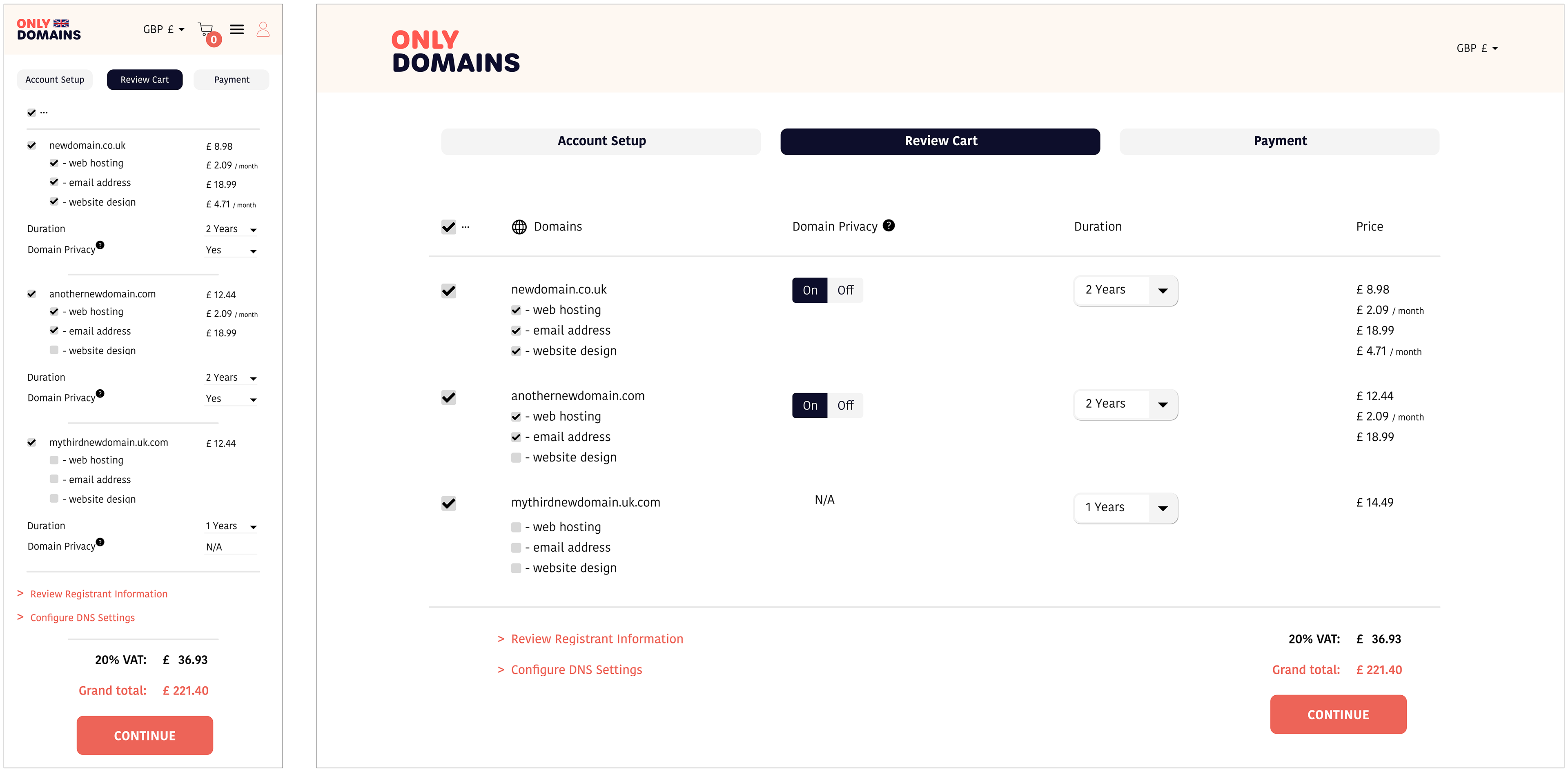
Proposed redesign to the cart review page.
Based upon user interviews and analysis of demographic data, the following key design considerations were made:
Clearly illustrate the costs involved.
Consider including purchase steps for awareness of time.
Consider displaying statistics for hosting an email service.
Keep designs above the fold.
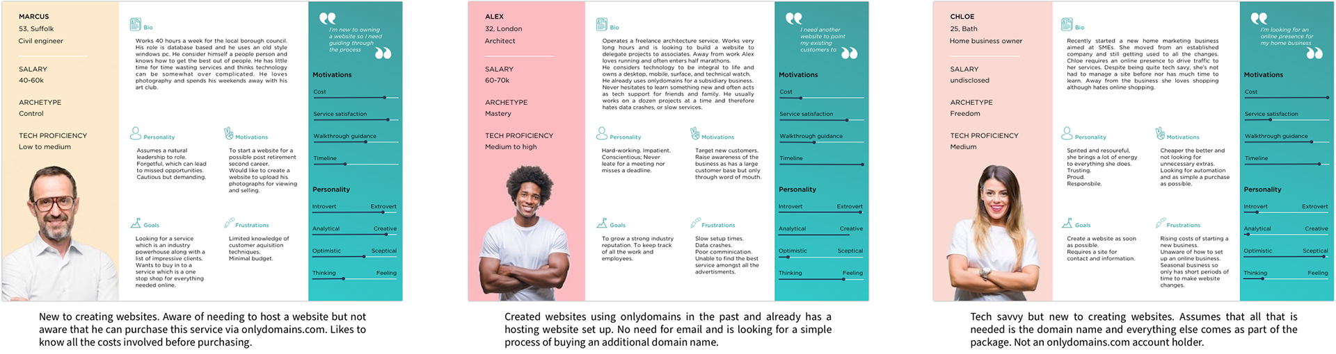
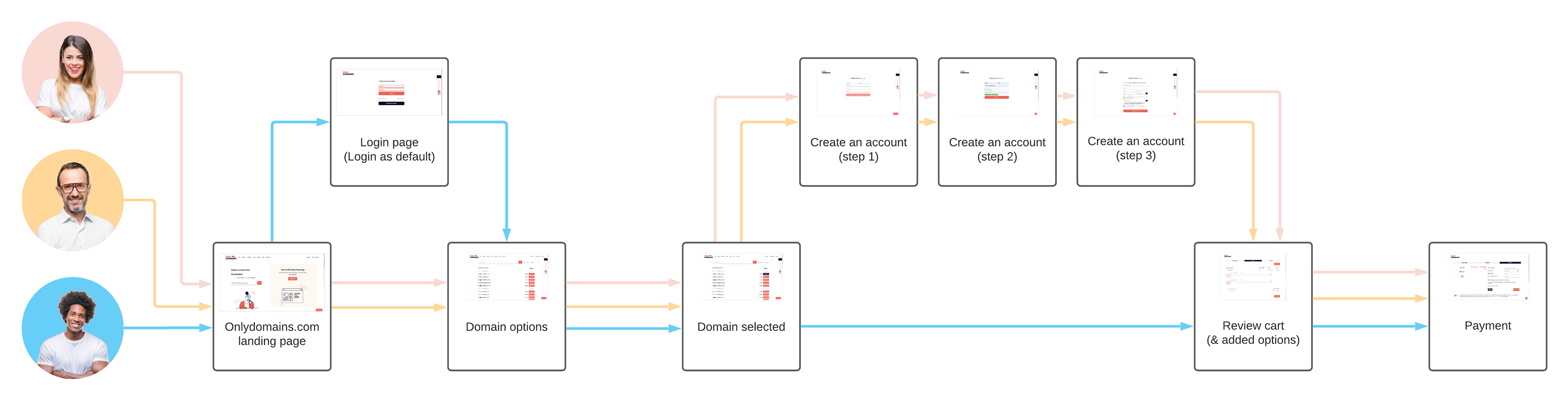
User journeys for the three personas.
For those without accounts their journey contains seven steps and one decision point. This is reduced to five steps for returning customers.
To maintain the current strong funnel conversion rate, designs will need to be integrated within the current flow but without unnecessarily increasing either the steps or the number of decision points.
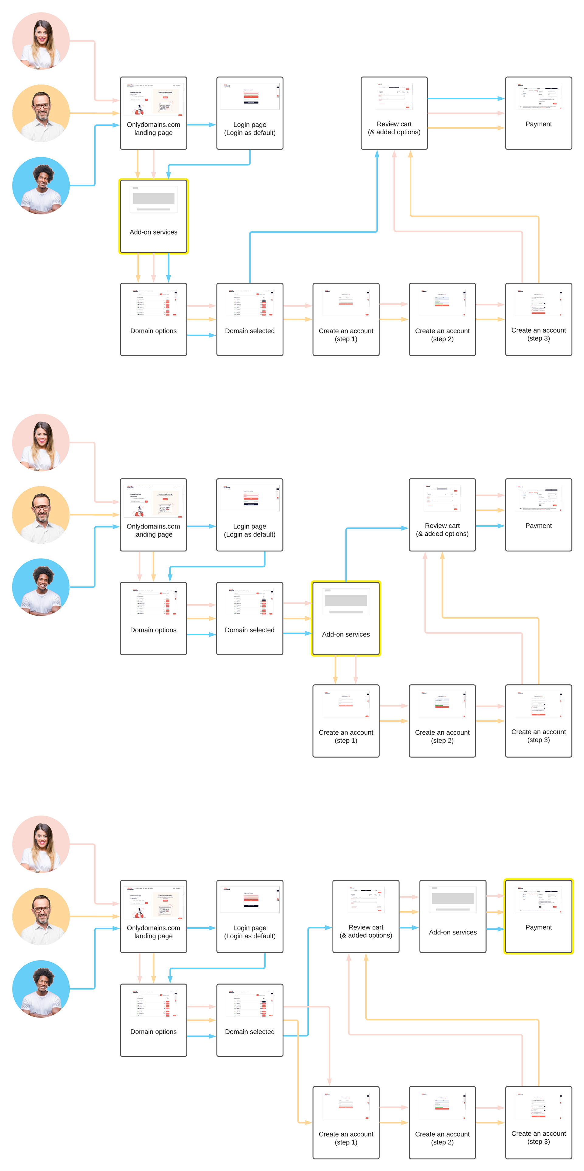
Exploring three options for promoting and encouraging users to buy add on services, including web hosting and email hosting. (Highlighted in yellow)
1. TOP OF THE FUNNEL
Positioned between search and results. Opportunity to provide information on pairing a domain with hosting services.
Advantages- Users are aware of the process and are not distracted by the purchase flow.
Disadvantages- User interest is currently low and, for personas like Chloe, may prompt further research before purchasing.
2. MIDDLE OF THE FUNNEL
Positioned after results.
Advantages- User interest is high and they are currently within the decision making stage.
Disadvantages- A second purchase could confuse the user.
3. BOTTOM OF THE FUNNEL
Positioned after the basket and before payment.
Advantages- User intent is very high.
Disadvantages- Might appear as an unnecessary added extra and be assumed as money wasting up-selling.
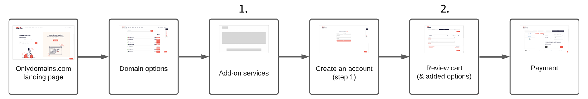
Proposed wireframed solution
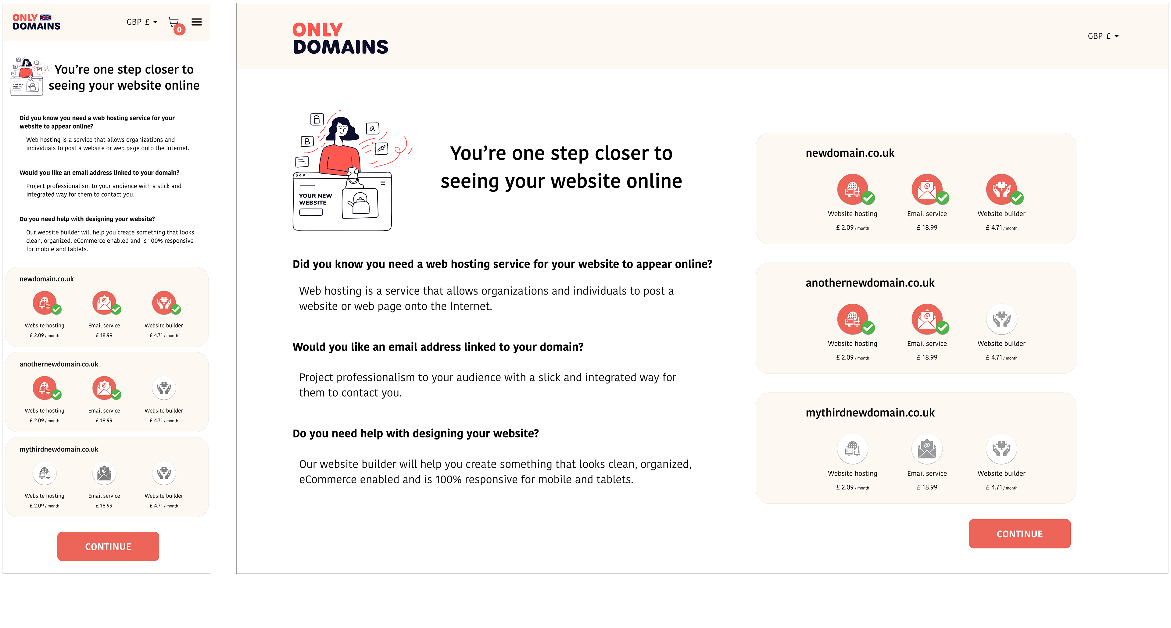
1. Position an additional page in the flow for users to learn about and add web hosting, email hosting and a web builder to their cart. This will be a page of its own to ensure the information does not fall below the fold on desktop and device.
2. Re-designed cart. Remove the web hosting option from the cart page. The average cart abandonment rate across all industries is 69.57%. A clean design with no up-selling to reduce the abandonment.
Design rationale
Add-on services
A new page and step within the flow. Positioned after the domain selection and before login/signup.
Designed to highlight the benefits of additional extras. Each option is explained with the benefits of the service. Analytics can be used here to test information text varients. This will avoid any potential drop-off points, including any questions which may cause the user to quit the purchase process.
Option selector split up into individual domains and clearly displays the price.This design allows onlydomain.com to have certain extras on as default.
All elements are positioned above the fold (depending on how many domains are bought).
Cart review
Proposed redesign to the cart review page.
Clean design with better alignment on desktop and mobile.
All options (hosting, emails, builder) are grouped with the domain. This avoids lots of scrolling and missed information. User can also add or remove any extras without having to return to the previous page.
Domain privacy is now visible on devices (not currently visible on the live site)
All elements are positioned above the fold (depending on how many domains are bought).
Further considerations
Include a video to explain web hosting.
People who view an explainer video are 4x more likely to convert.
Further user research.
Conduct contextual inquiries and view heatmaps.
Animation.
Smooth page transitions throughout the purchasing phase.